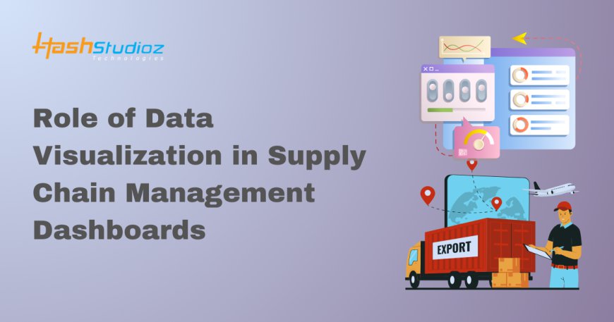
Role of Data Visualization in Supply Chain Management Dashboards
Discover the impact of data visualization in supply chain management dashboards. Learn how visual tools enhance decision-making, improve efficiency, and optimize supply chain performance.
Supply Chain Management (SCM) is a crucial aspect of business operations that requires constant oversight, data analysis, and decision-making to ensure efficiency. In today's increasingly complex global supply networks, businesses are faced with vast amounts of data from multiple sources, such as inventory levels, shipping schedules, supplier information, and customer demand. Handling all of this data manually or using traditional methods can be inefficient and prone to errors. This is where Supply Chain Dashboards come into play, serving as powerful tools for real-time monitoring, analysis, and decision-making.
At the heart of these dashboards is data visualization, an essential element that turns raw data into easily digestible information. Through interactive charts, graphs, heat maps, and other visual elements, data visualization helps supply chain managers quickly understand trends, detect anomalies, and make informed decisions. In this blog, we will explore how data visualization enhances the effectiveness of Supply Chain Dashboards, improves operational efficiency, and enables proactive supply chain management.
1. Understanding Supply Chain Dashboards
A Supply Chain Dashboard is a real-time, dynamic interface that provides a comprehensive overview of key performance indicators (KPIs) across the entire supply chain. These dashboards pull data from various sources like warehouse management systems (WMS), enterprise resource planning (ERP) systems, and logistics platforms to give a unified view of the supply chain.
- The key components of supply chain dashboards typically include:
- Inventory Levels: Real-time data on current stock levels across multiple locations.
- Order Status: Tracking of customer orders from the point of sale to delivery.
- Supplier Performance: Insights into the reliability, timeliness, and quality of suppliers.
- Shipping and Logistics: Data on transit times, delivery schedules, and carrier performance.
- Customer Demand: Analysis of sales patterns, order volumes, and demand forecasting.
While the functionality of a supply chain dashboard lies in its ability to aggregate data, its true value is realized through data visualization. Visual tools make it easier to interpret and interact with the data, which is crucial for streamlining supply chain operations.
2. The Importance of Data Visualization in Supply Chain Management
In SCM, the decision-making process depends heavily on data. However, the sheer volume and complexity of this data can overwhelm managers and lead to inefficiencies. Data visualization helps solve this problem by translating complex datasets into visual formats that are easy to understand.
Some key benefits of incorporating data visualization into Supply Chain Dashboards include:
a. Simplifying Complex Data
The supply chain involves numerous processes and participants, each generating significant amounts of data. When this data is presented in spreadsheets or raw numbers, identifying patterns or spotting inefficiencies becomes difficult. By using data visualization tools such as graphs, charts, and heat maps, supply chain dashboards can present this data in a more understandable format.
For example, a dashboard might show a heat map of inventory levels across various warehouses, with red indicating low stock and green showing optimal levels. This quick visual reference allows managers to make immediate decisions regarding stock replenishment without having to sift through pages of data.
b. Enhancing Real-Time Monitoring
In a fast-paced supply chain environment, real-time decision-making is critical. Supply Chain Dashboards equipped with data visualization tools offer instant snapshots of current performance, enabling managers to take proactive actions.
For instance, real-time data visualization can alert managers to bottlenecks in shipping by showing delays as they occur. A visual representation of shipping routes, overlaid with current traffic data, can help logistics teams quickly re-route shipments, minimizing delays and ensuring timely deliveries.
c. Identifying Trends and Patterns
Effective supply chain management relies on anticipating future demand, identifying potential risks, and optimizing resource allocation. By using historical data and predictive analytics, data visualization in Supply Chain Dashboards helps managers detect trends and patterns that may otherwise go unnoticed.
For example, a line chart showing a sudden spike in product demand during specific times of the year can help supply chain managers adjust inventory levels in advance. Similarly, identifying a consistent drop in supplier performance through visual dashboards enables companies to take corrective actions before these issues affect operations.
d. Facilitating Collaboration and Communication
Supply chains often involve collaboration between various stakeholders, including suppliers, logistics providers, and internal teams. Data visualization improves communication by making it easier for all stakeholders to understand complex information. Dashboards can be shared across departments, allowing for transparent decision-making.
For example, a well-constructed Supply Chain Dashboard can serve as a single source of truth for supply chain managers, procurement teams, and suppliers. Everyone can access the same data presented in a format that is easy to interpret, thus facilitating more effective collaboration and timely decisions.
3. Key Data Visualization Tools for Supply Chain Dashboards
To maximize the potential of a Supply Chain Dashboard, the right data visualization tools must be integrated. Here are some of the most effective types of visualizations used in SCM dashboards:
a. Bar and Line Charts
Bar and line charts are used to compare variables such as sales volumes, supplier performance, or shipping times over different time periods. These visual tools help managers track progress against KPIs and identify trends.
For example, a line chart might be used to show the change in on-time delivery rates over the past six months. Managers can instantly see whether performance is improving or declining and take appropriate action.
b. Heat Maps
Heat maps visually represent data through color-coding, allowing managers to spot patterns at a glance. In SCM, heat maps are often used to monitor inventory levels, warehouse performance, or geographic sales distribution.
A heat map might display low stock levels in red and high levels in green, helping managers quickly identify which warehouses need replenishment or where overstock is occurring.
c. Pie Charts
Pie charts are ideal for representing proportions, making them useful for analyzing the distribution of orders, sales, or supplier performance. For example, a pie chart could show the proportion of orders that are on time versus those that are delayed, giving managers a clear visual of delivery performance.
d. Dashboards with KPIs
Combining multiple visualizations into a single Supply Chain Dashboard allows managers to track several KPIs in one place. Key metrics such as order fulfillment rate, on-time deliveries, and lead times can be displayed on one dashboard, offering a comprehensive view of supply chain performance.
e. Geographic Maps
Supply chains often involve shipping goods across multiple regions. Geographic maps integrated into Supply Chain Dashboards provide a visual representation of shipments in transit, enabling managers to track the progress of goods and quickly identify delays or issues in specific regions.
4. Real-World Application of Data Visualization in SCM Dashboards
Many companies have already implemented data visualization into their supply chain management strategies with remarkable success. Let’s look at a few real-world examples:
a. Amazon
Amazon’s supply chain relies on real-time dashboards that use data visualization to monitor inventory levels, track shipments, and optimize delivery routes. The company uses complex algorithms that visually represent demand forecasts and supplier performance, ensuring a seamless supply chain operation.
b. Walmart
Walmart uses SCM dashboards to monitor its global supply chain network. The dashboards leverage data visualization to optimize inventory levels, analyze customer demand, and monitor supplier performance, ensuring that products are always available to meet customer demand while minimizing excess inventory.
c. UPS
UPS uses advanced dashboards to track package delivery in real time. Their data visualization tools highlight delivery routes, traffic patterns, and shipping delays, allowing the company to optimize its delivery network and improve customer satisfaction.
5. Challenges and Solutions in Implementing Data Visualization for SCM Dashboards
While data visualization offers numerous benefits, there are challenges to implementing it effectively in Supply Chain Dashboards:
-
Data Integration: SCM dashboards pull data from various sources, which can make integration difficult. The solution is to use robust data integration tools that ensure data accuracy and consistency.
-
User Training: Not all users are familiar with interpreting visual data. Training programs that educate employees on how to use the dashboard effectively are crucial.
-
Customization: Every supply chain is different, so dashboards need to be customizable. Choose platforms that allow flexibility in visual representation and KPI tracking.
Conclusion
Data visualization plays a pivotal role in enhancing the effectiveness of Supply Chain Management Dashboards. By transforming complex data into intuitive visual formats, it simplifies decision-making, improves real-time monitoring, and helps identify trends and inefficiencies in the supply chain. As businesses continue to digitize their supply chain operations, investing in advanced Supply Chain Dashboards with robust data visualization capabilities will be crucial for staying competitive, reducing operational costs, and improving overall performance.
Read also:
https://postr.yruz.one/top-10-benefits-of-hiring-a-business-intelligence-consulting-firm