How Box Shadows Impact User Experience: Tips for Designers
Discover how box shadows enhance user experience by improving visual hierarchy, depth, readability, and interactivity. Tips included for effective use.

Box shadows are a powerful yet often underused tool in web design. They add depth, guide the user’s eye, and improve readability, all of which contribute to a positive user experience (UX). With just a few simple adjustments, box shadows can make websites feel more interactive, polished, and visually appealing. In this article, we’ll explore how box shadows impact UX and offer tips for using them effectively in design.
If you are totally begineer with box shadows use can use this box shadow generator tool to create fully functional shadows.
Enhancing Visual Hierarchy with Box Shadows
Visual hierarchy is essential in guiding users through a website. It helps them understand what’s most important on a page, leading them to key actions or information. Box shadows play an important role in establishing this hierarchy. By adding shadows to certain elements, designers can highlight these elements and make them stand out.
For example, shadows can draw attention to buttons, images, or cards, which are often primary interactive elements. When used on essential elements, shadows give them a subtle lift, making them appear closer to the viewer and, therefore, more important. A well-placed shadow naturally leads users to these elements, improving the UX.
Practical Tip: Use gentle shadows to emphasize primary elements on the page. For instance, a soft shadow on a call-to-action button can make it stand out without overwhelming the design.
Creating Depth and Realism in UI
Depth makes a website feel less flat and more engaging. By using shadows, designers can simulate the effect of depth, making elements look three-dimensional. Depth in design is visually appealing and can make the interface easier to navigate.
Shadows can also differentiate between elements that are supposed to feel close to the user and those meant to be in the background. A more intense shadow on a pop-up box, for example, creates the impression that it’s closer than other parts of the interface. On the other hand, subtle shadows on background elements give them a stable, grounded feel.
Practical Tip: Apply lighter, diffused shadows to elements you want to appear elevated, such as modal windows or floating action buttons. Use darker, sharper shadows for objects that should feel grounded, like background cards or containers.
Improving Readability and Accessibility
Shadows are not only decorative; they can also make a design easier to read. By separating layers of content, shadows provide clarity and distinction. This separation is particularly useful when there are overlapping elements or when text needs to stand out against a busy background.
For example, adding a subtle shadow to text containers or overlay cards can make them more readable, as it separates the text from the background. Shadows also enhance accessibility by helping users with low vision better distinguish different elements on the page.
Practical Tip: When working with complex backgrounds or layered content, add a small shadow to text or icons. This gives them visual separation, making them easier to read without adding visual noise.
Enhancing Interactivity and Engagement
Avoiding Common Pitfalls with Box Shadows
While shadows can greatly improve UX, they must be used carefully. Overusing shadows can clutter a design, making it visually overwhelming and confusing. A page crowded with shadows can distract users and take away from a clean, professional look.
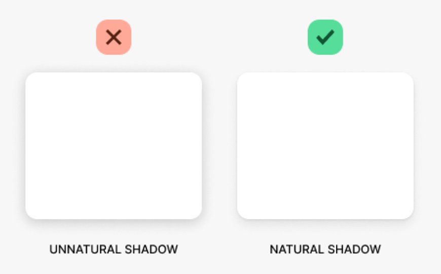
Another common mistake is inconsistent light sources. Shadows should appear as though they are cast from the same light source across the entire page. If some shadows are angled to the left while others are angled to the right, it can confuse users and detract from the visual consistency of the design.
Practical Tip: Use shadows sparingly. Limit them to a few key elements that need emphasis. Additionally, maintain a consistent light source direction for all shadows to create a unified, cohesive look.
Conclusion
Box shadows are a small but impactful detail in web design that can make a big difference in user experience. They enhance visual hierarchy, add depth, improve readability, and create interactivity. Used thoughtfully, shadows help users navigate content with ease, making the design feel cohesive and polished. As you design, remember that subtle shadows often make the greatest impact. With careful application, box shadows can elevate your website's UX, providing a seamless and enjoyable experience for all users.

 realtec