

CBD Packaging Trends Shaping Product Presentation and Brand Growth
Explore the design shifts reshaping CBD packaging in 2026 minimalist layouts, transparent lab testing callouts, refillable formats, and typography-led branding replacing generic leaf icons and kraft-brown defaults

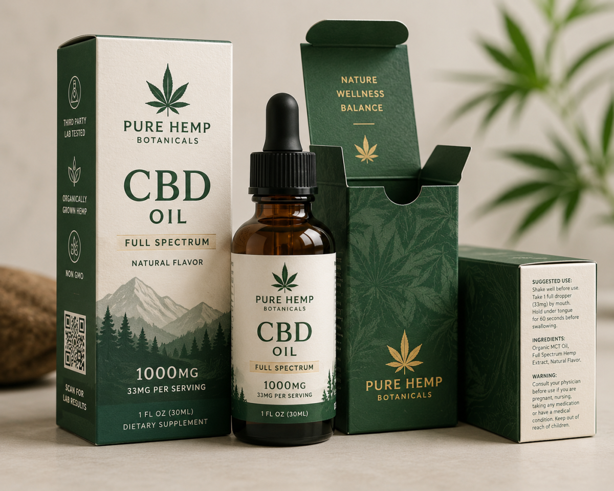
Two years ago, most CBD packaging looked like it came from the same three templates kraft brown, a leaf icon, green accent text. Walk a wellness aisle today and that's changing fast. Brands are treating packaging less like a compliance wrapper and more like a genuine extension of how the product is supposed to make someone feel, and that shift is showing up in some fairly specific, trackable design choices.
Minimalism Has Replaced "Natural" as the Default Signal
For a while, looking natural meant looking rustic heavy texture, earthy color, handwritten-style fonts. That's giving way to something cleaner. A lot of newer CBD brands are moving toward stark white or muted pastel packaging with a single accent color and tight, restrained typography, betting that simplicity now reads as more trustworthy than rustic ever did.
This isn't purely aesthetic drift. It tracks with how the CBD buyer base has shifted. Early customers skewed toward people already comfortable with hemp and herbal products, who responded to earthy visual cues. The buyer base has broadened since, and a chunk of newer customers respond more to packaging that looks closer to a pharmacy shelf than a farmers market table.
Functional Transparency Is Becoming a Design Element, Not Just a Requirement
QR codes linking to lab results used to be a small, almost apologetic addition a tiny code tucked into a corner because regulation required it. Brands are increasingly designing that code into the packaging as a featured element instead, sometimes with a short callout line like "scan to verify" placed prominently rather than buried.
That shift matters because it changes what the disclosure communicates. A hidden QR code reads as the bare minimum. A prominent one reads as a brand actively inviting scrutiny, which tends to land better with a customer base that's grown skeptical after years of mislabeled or inconsistent CBD products.
Package Formats Are Diversifying Beyond the Standard Tincture Box
|
Format Trend |
What's Changing |
Why It's Gaining Traction |
|
Multi-dose travel packs |
Single-serving sachets bundled in a slim outer box |
Fits into on-the-go routines rather than a bathroom cabinet |
|
Refill-friendly rigid boxes |
Two-piece boxes designed for a reusable outer shell with replaceable inserts |
Reduces packaging waste across repeat purchases |
|
Modular gift sets |
Multiple SKUs (tincture, topical, capsules) in one branded outer box |
Appeals to gifting occasions the category didn't traditionally target |
|
Compact capsule tins |
Metal or rigid tins replacing standard folding cartons for capsule products |
Feels more premium and holds up better to daily pocket or bag carry |
A brand offering a 1-ounce tincture in a standard 3.5 x 4 inch carton is still common, but the format experimentation happening around it refillable shells, multi-product sets reflects a category trying to differentiate beyond just changing the label graphics.
Matte Textures Are Overtaking Gloss, Especially in Premium Lines
Soft-touch matte lamination has become close to a default finish choice for CBD brands positioning themselves at a higher price point. It photographs well under the diffused lighting most product photography uses now, resists fingerprints better than gloss during handling, and has become visually associated with "considered" packaging across cosmetics and wellness more broadly, not just CBD specifically.
Gloss hasn't disappeared, but it's increasingly reserved for accent details a single glossy logo against a matte background rather than covering an entire box, which was more common in earlier CBD packaging generations.
Sustainability Claims Are Getting More Specific, Not Just More Common
Vague language like "eco-friendly" is losing credibility fast with a customer base that's learned to be skeptical of unverified claims. What's replacing it is packaging that states specifics directly on the box FSC-certified board sourcing, a defined recycled content percentage, confirmation that a coating is compatible with standard curbside recycling rather than requiring a specialized facility.
This trend is partly regulatory pressure and partly customer demand, but the practical effect is the same either way. Brands that can back a claim with a verifiable specific are differentiating themselves from brands still relying on a green color palette to imply sustainability without saying anything concrete.
Typography Is Doing More Identity Work Than Illustration
A noticeable shift away from heavy reliance on leaf and hemp-plant illustration is underway, with more brands leaning on a distinctive typeface as their primary identity marker instead. Illustration-heavy packaging has become so common across the category that it's stopped differentiating anyone a strong, consistent typographic choice now stands out more than another rendering of a hemp leaf.
This tends to work particularly well for CBD brands trying to position closer to general wellness or skincare than to traditional herbal products, since typography-led design already carries strong associations in those adjacent categories.
Where the Trend Data Gets Complicated
Not every shift applies evenly across product types. Topical products balms, creams, roll-ons are moving toward these minimalist, typography-forward trends faster than tinctures and capsules, which still lean more heavily on compliance-heavy layouts given the amount of dosage information they're required to display. A brand designing across a full product line sometimes ends up balancing two slightly different visual approaches depending on the format, rather than applying one trend uniformly across everything they sell.
Manufacturers working across multiple CBD product categories, including suppliers like custom CBD packaging boxes specialist One Custom Boxes, tend to see this format-specific variation firsthand, since a tincture box and a topical jar rarely follow identical design logic even within the same brand.
The Practical Takeaway
CBD packaging is moving away from earthy shorthand and toward cleaner, more typography-driven design, with transparency features like lab-result QR codes becoming a visible part of the branding rather than a buried afterthought. Format experimentation refillable shells, multi-product sets, travel-friendly formats is opening up differentiation that color and logo work alone can't provide anymore. Brands paying attention to these shifts aren't just following a trend for its own sake. They're responding to a customer base that's gotten more discerning about what packaging actually communicates, and design that once read as sufficient now increasingly reads as dated.





Comments (0)